Evo Car Share Redesign
ROLE
UI/UX Designer
USED TIME
7 weeks
INSTITUTION
University Of British Columbia
PROJECT MEMBERS
Shiyu(Will) / Celeste Wu / Hans Song
Introduction
Evo is a carsharing service in British Columbia that provides people with ease of access to a rental car for a short period of time. Different from the traditional way of car rental, Evo offers a one-way trip experience that gives the Evo users flexibility of picking up and dropping off a car at different locations without time restrictions. Evo was founded in early 2015 by the British Columbia Automobile Association (BCAA) which is a member-based organization serving a broad range of car services. By the end of 2021, Evo has reached a fleet of about 1,700 vehicles with service coverage in most of Metro Vancouver and Victoria. The Evo Car Share app is a mobile application that allows users to manage their bookings, check out parking locations, and access 24/7 customer assistance. Users can also start and end their trips through the Evo app at the tap of a button.
The purpose of this project is to investigate the usability issues of the Evo app and redesign the interface, which will make a meaningful impact on the user experience. Currently, the lack of information transparency in cost and customer support may lead to confusion and overwhelm for inexperienced users. As driving has already been a source of pressure for many drivers (Meyer, 2022), redesigning the Evo app interface could potentially help Evo users to reduce the psychological burden of using the app while they are on the road and further improve their driving experience.
Mission Statement
Evo Car Share does not have their own mission or vision statement. As a product and service owned by BCAA, Evo is aligned with BCAA’s values and goals. Given BCAA’s purpose of “empowering British Columbians to move forward” and mission of “inspiring every British Columbian to be a member” (BCAA, n.d.), our team concluded the Evo Car Share’s mission statement as follows:
“To develop a shared transport network of flexibility and sustainability for British Columbians to get around with confidence.”
Goals and Objectives
Evo does not have their company’s goals explicitly listed on the website or marketing channels. Based on secondary research from relevant websites, we concluded and drafted the overall goals of the Evo Car Share as follows:
Based on the goals listed above, we defined some specific objectives of the Evo Car Share app as follows:
Major Stakeholders
The major stakeholders we identified are end users, Evo management and operations team, BCAA, and local government.
Primary Users
By definition, end users are the people who actually use the product and service. Evo’s end users include but are not limited to potential users or likely car-sharing customers who would like to rent a vehicle for a short time period, infrequent Evo users who use Evo’s cars for transport with a low reuse rate, and frequent or loyal Evo users who have used the services for a long period of time. As required by Evo, users need to be at least 18 years old, have a credit card, a valid driver's license, 2 years of driving experience, and meet the driving requirement verified by the driving record check in order to become an Evo member (Evo, n.d.-a). Evo users heavily rely on the app to pick up and drop off their vehicles. They pay either hourly or daily rates to Evo in exchange for the temporary possession of the vehicle.
Vulog
Vulog is a technology provider for shared mobility solutions, including car sharing, bike sharing, scooter sharing, and all forms of corporate transportation rental. Vulog’s mission is to “make a positive impact on the planet via technological innovations that revolutionize mobility” (Vulog, n.d.). Vulog works as a product development and operations team that helps to build the Evo app as well as Evo’s in-car technology solutions like GPS tracking.
British Columbia Automobile Association
BCAA is the parent company and direct investor of Evo Car Share. BCAA offers auto-related products and services, including car insurance, roadside assistance, auto repair, and Evo Car Share. As one of the product offerings, Evo supports BCAA’s goal of “empowering British Columbians to move forward” and their belief in “protecting our home” and “shaping the future” through revolutionary hybrid vehicles with a roof-top bike rack.
Local Government
Evo Car Share works closely with local governments like the City of Vancouver to fill the market gap of carsharing demands from high urban population density and achieve the goal of sustainable transportation. Convenience around accessing and parking Evo vehicles creates a focal point in product marketing and gains the popularity of the service among young, environmentally conscious people. The city governments help to make designated Evo parking spaces possible, giving users the flexibility of returning an Evo car in any approved spot in Metro Vancouver.
User Need Analysis
Potential Users
Potential Evo users are the group of people who have a potential interest in using the Evo car-sharing services but have never tried it out. Most of the potential users are also first-time users of a car-sharing program. The major tasks they would accomplish on the app are registering an account, completing the driver's license information, searching for an Evo car nearby, and booking a car. We also expect that potential users would seek customer support and other forms of helpful information when needed. An intuitive and navigable onboarding experience is critical for potential users to build up their mental model and quickly adapt to the Evo app.
Infrequent Users
Infrequent users are defined as Evo users who have used the Evo car-sharing service a couple of times but only visit back to the app again for specific purposes. We expect that most infrequent users do not see car-sharing as their primary means of transportation. The major tasks infrequent users would accomplish on the app are signing in to the account, booking a car, and looking for specific information like billing, parking, and refueling. Different from potential users, infrequent users have already built up their mental models of using the Evo app but they are far from being an expert on the functionality and navigation of the app. Even a small usability pitfall would hurt their satisfaction, cause confusion, and possibly lead them to forge the use of the app.
Frequent or Loyal Users
Frequent or loyal users are the groups of people who prefer using Evo car-sharing services on a frequent basis. We expect that many of the frequent or loyal users consider Evo as one of their primary modes of transportation. The major tasks they would accomplish on the app are booking a car, exploring new features, and contacting customer service for help. As they have already established a level of experience navigating the Evo app, frequent or loyal users would expect some shortcuts to skip unnecessary information and speed up the interactions.
Competitor Analysis
Method and Process
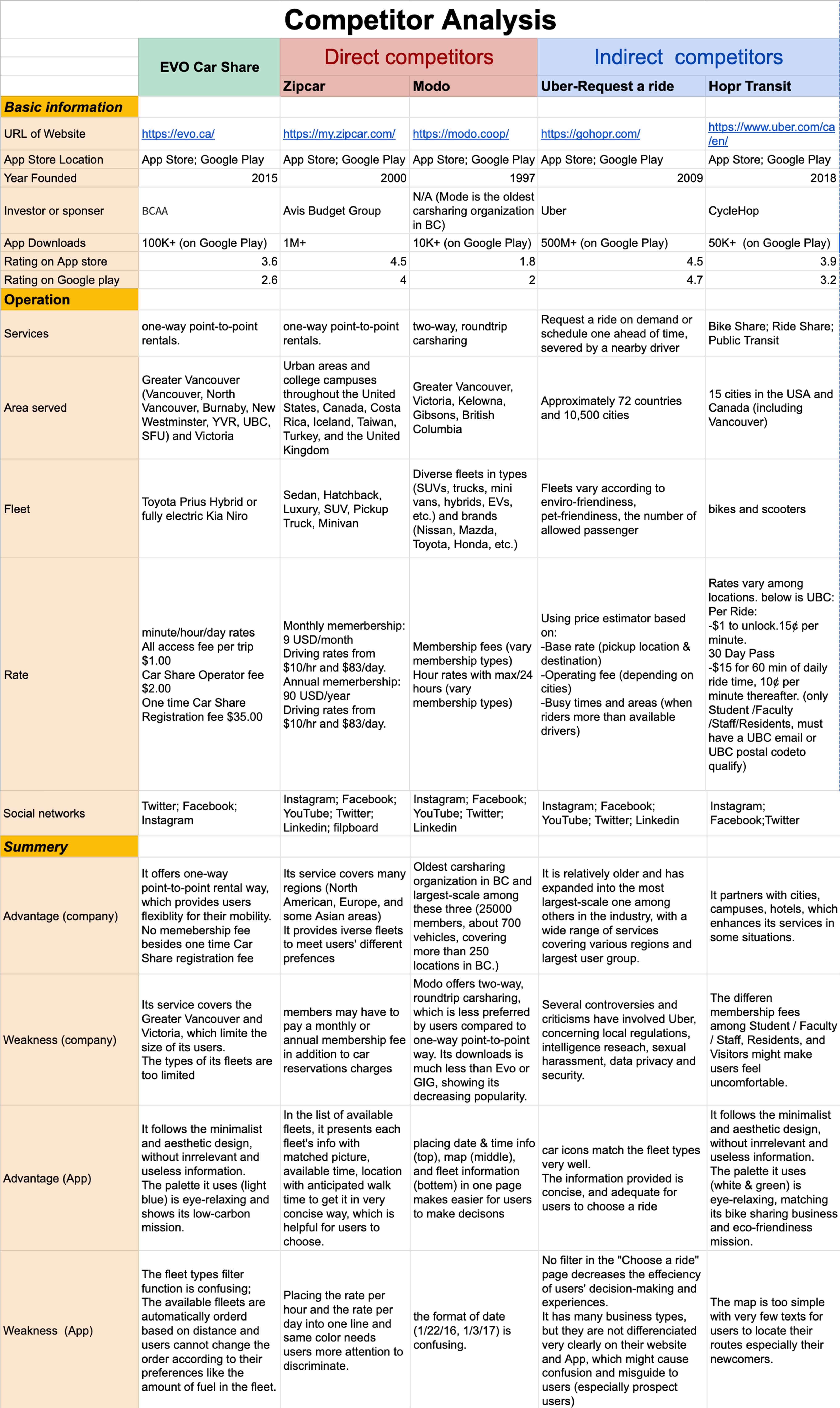
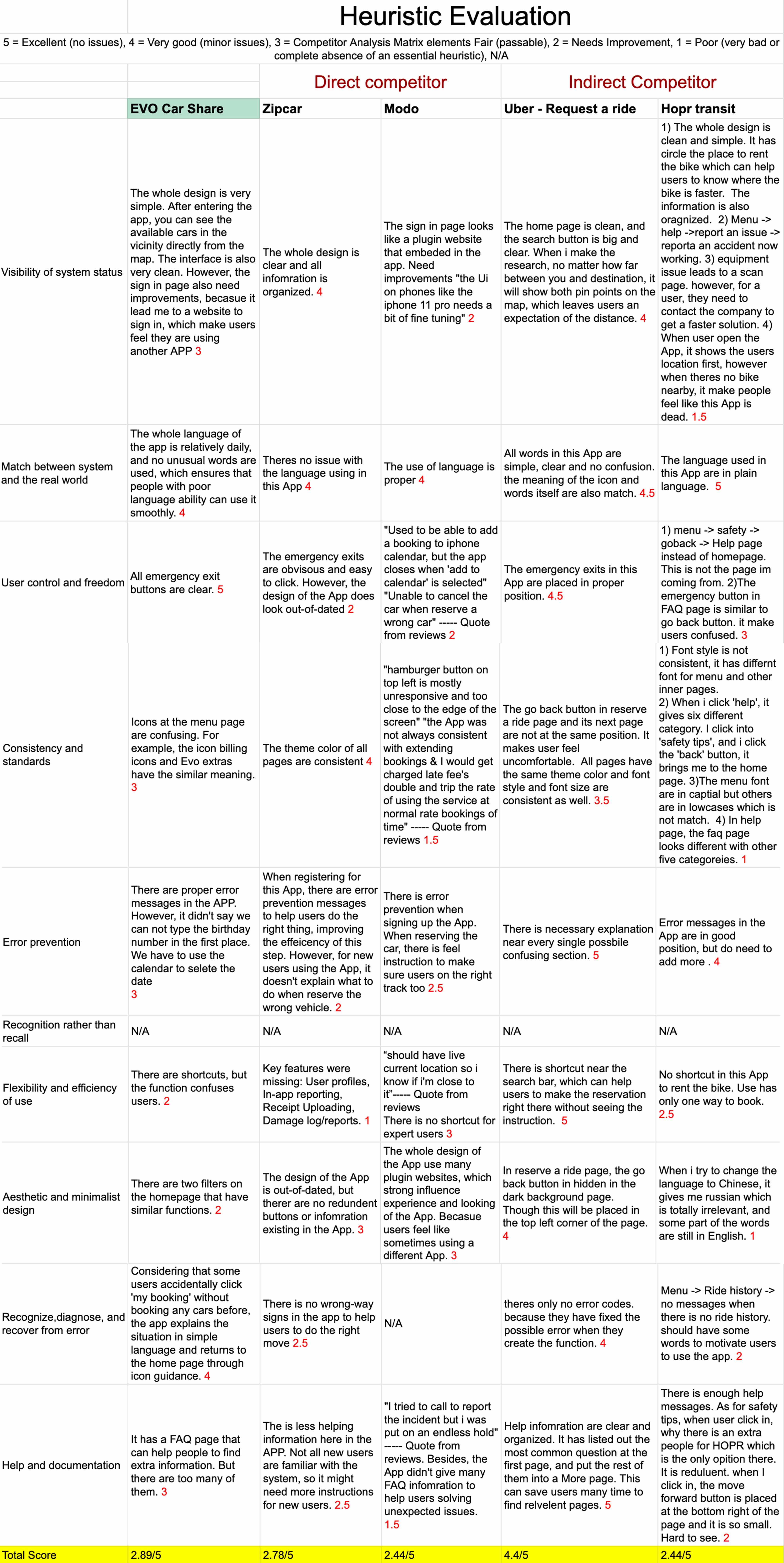
Based on the stated mission, goals, objectives, and the identified potential user groups of our mobile application, our team began the competitor analysis by identifying existing applications that provide similar services. We found that there are numerous apps in the transportation industry providing mobility service, but there are significantly fewer options for local users (British Columbians) who want to flexibly pick up and drop off cars in different locations. Since Evo is focused on a shared vehicle network in BC, we looked for four relatively widely-used competitor apps that provide mobility services. We selected two apps that are also focused on car-sharing services as our direct competitors and two indirect competitors that offer a slightly different product but target a similar audience.
Limitation
In the process of the competitor analysis, we had two major limitations. The first one is that we only select four mobile applications to review, two direct competitors and two indirect competitors. And there is limited overlapping in their service types and service areas. This means there is a lack of competition among them, which cannot help us to identify all common user needs in mobility and the app feature that best supports users.
The second limitation is team members’ limited access to the four competitor apps. Because only paid members can have full access, we did not explore all pages and functions in every app. So, our competitor analysis findings from either the Competitor Analysis Matrix or Heuristic evaluation lack a sense of comprehensiveness and objectivity. If we could as paid members explore all pages and experience all functions in the apps, the final findings and results might be kind of different
User Review Analysis
Method and Process
Product reviews are one of the most thorough and useful sources of insider information about the customer and user experience, which could be used to debug the current product and initiate new feature designs (Dye, 2021). Our team looked into 49 user reviews on the Evo Car Share mobile application to gauge Evo customers’ perspectives on what usability issues to focus on and how to improve the user experience. The goal of the review analysis is to transform the unstructured qualitative data into structured findings that lead to a better understanding of Evo's current product offering and prepare us for the usability study.
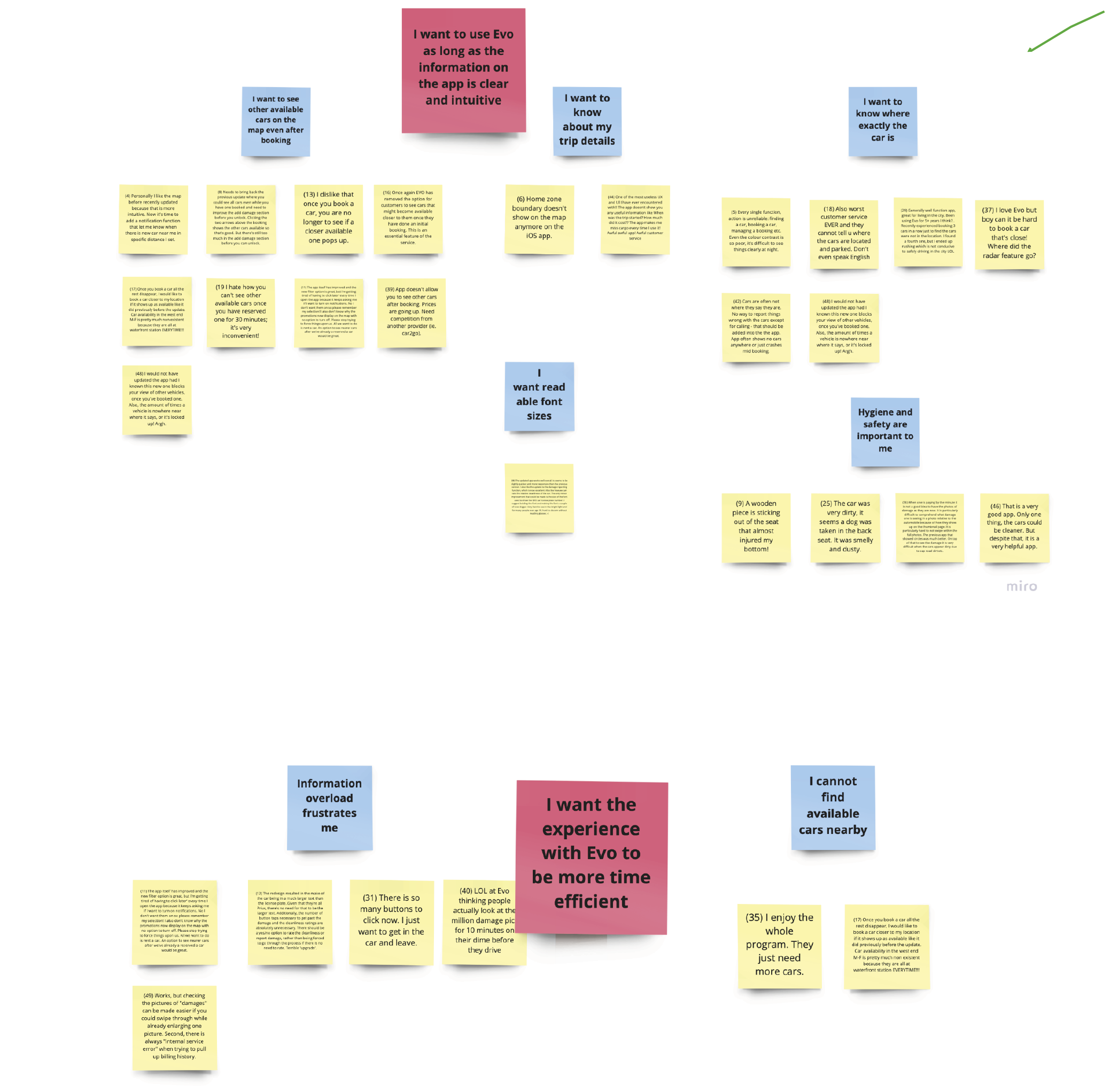
We decided to study the user reviews on the App Store because it’s one of the most commonly adopted app distribution channels for phone users. We determined the time frame for data collection to be from September 1, 2022, to October 12, 2022, which is the date of research. This has helped us to narrow down the focus to current reviews and avoid spending unnecessary time looking into outdated reviews that could be already noticed and addressed by the Evo operations team. We copied and pasted each review into a sticky note on Miro for further visualization analysis.
Analysis
After thoroughly reading through each review on the Miro board, we applied the affinity diagram to quickly organize unstructured review data and consolidate the insights within a short period of time. The qualitative data were grouped into nine second-level labels based on relativity and mapped onto an affinity diagram. Four top-level labels were also aggregated from the second-level labels to identify themes and patterns in the user reviews.
Limitation
Limitations of the review analysis include its small data sets. Extrapolation of the user reviews on App Store from September 1, 2022, to October 12, 2022, as a whole may not be well representative given the convenience sampling used for data collection. In addition, a lack of research on user reviews from other app distribution platforms like Google Play could lead to deficiencies in the data. Research also suggests that online reviews have a highly polarized distribution of opinions with extremely positive and negative comments (Klein et al., 2018). We acknowledge that the dual-edged nature of the user reviews may bias the view and interpretation.
Finding
Usability Study
Method and Process
We conducted a usability study on 6 people through convenience sampling. The goal of the usability study is to investigate the ease of access and use of the Evo Car Share mobile application. The study consists of two parts, including a user test followed by a short semi-structured interview (Click here to see the protocol)
Before starting the test, we discussed the design of the task question and interview question through two meetings. After completing the question design, we tested whether the whole process was smooth, logical, and met the characteristics of the App we wanted to test. Then, we rehearsed internally. Finally, we ensured that the whole process could be completed within 15-30 minutes. The way we test included in-person and online testing. For in-person testing, we rented a study room in advance to ensure the testing environment was quiet and comfortable, which was good for us to observe users' behavior when using the App. In order to monitor the user's behavior on the App, we provided a cell phone with a screen recording function as well. We then recorded their behavior on the App for future observation. Additionally, we created some question cards to help those interviewees who might miss the critical points in the test process. 17 As for online testing, we interviewed via Zoom. We used Zoom's audio recording and live transcript features in this stage to record the conversation. Once we completed the usability study, we used an app called 'Descript' to translate the speaking to text to see if we missed any details users mentioned. After obtaining the data, we integrated all the data through Google Sheets to observe the problems encountered by users. In the end, we met to discuss the participants' interesting behaviors and feedback. The goal was to find if any issues were consistently happening and feedback multiple times mentioned.
Analysis
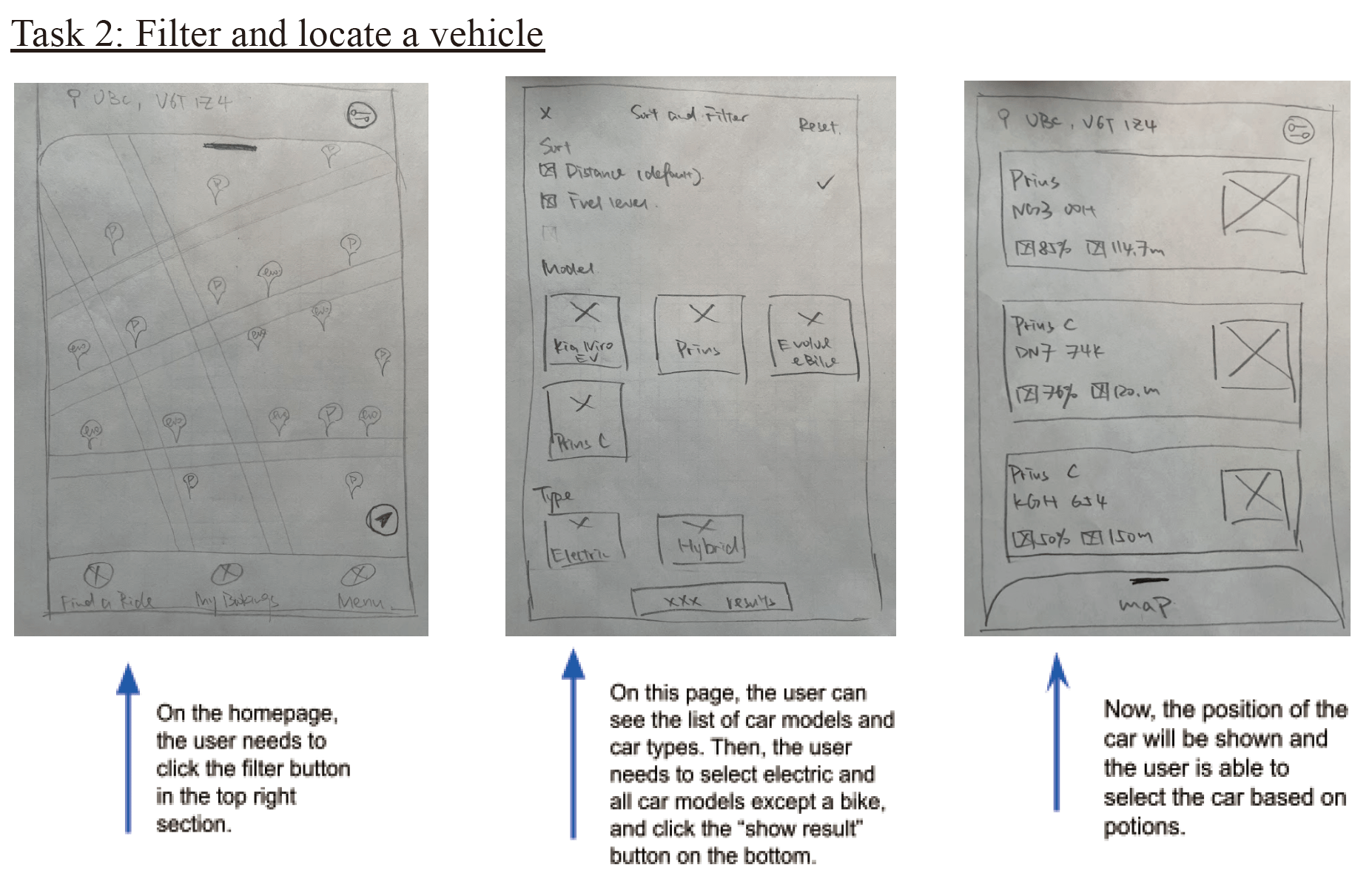
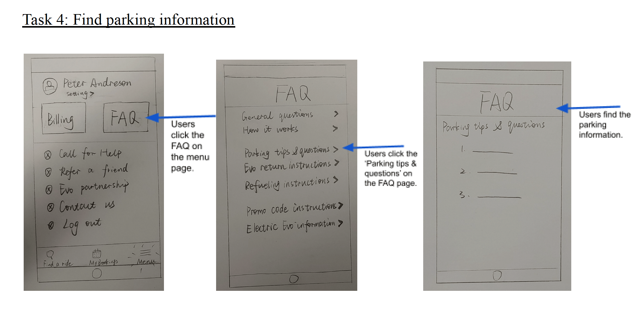
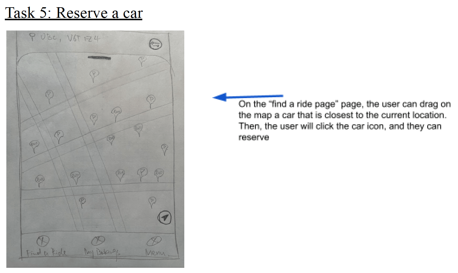
All participants have trouble understanding the sentence "Is your driver's license address the same as your mailing address?" in the sign-in step. When asking users to reserve a specific car model, whether new users or expert users, most prefer to drag the map to find their wanted vehicle, and only one uses the filter function to find the car. Everyone can find the right place efficiently by asking for personal editing information. However, participants behaved differently when asked to find legal parking information. Two participants can directly find the parking tips section on the Menu page. Three participants expected to find the information on the homepage by zooming on the map to see the parking information, which is not the correct way, but they could still find the page in the end. The last participant never found the parking information because he is focused on looking for the information on the homepage. As for the last task, when the participants were asked to find the refuel information, surprisingly, 5 of them could find the refuel page in a short time, except one participant who was looking for the Evo extra page, but he got the right page in the end
Finding
Major Findings
Based on the results from our Competitor Analysis, Review Analysis, and Usability Study, we identified four major findings about common user needs and the app features that best support users. Here’s the summary of user need analysis:
Persona
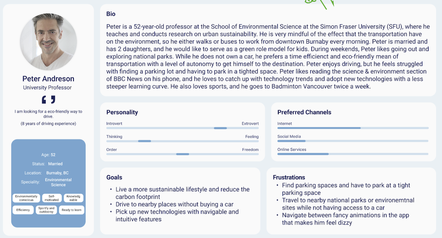
Persona1
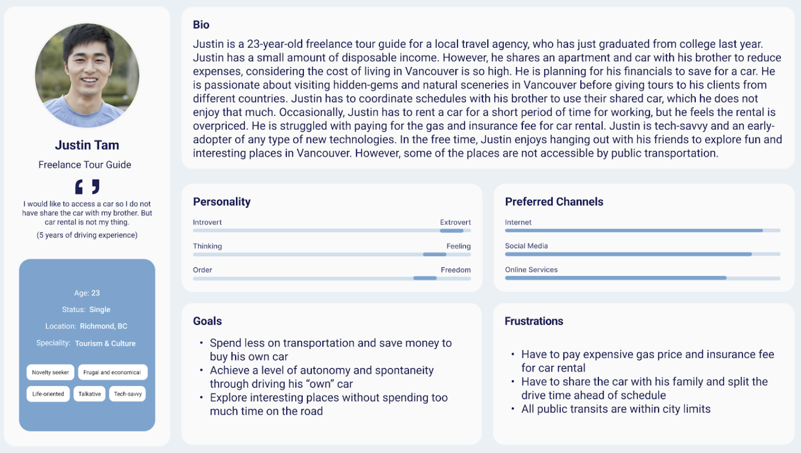
Persona2
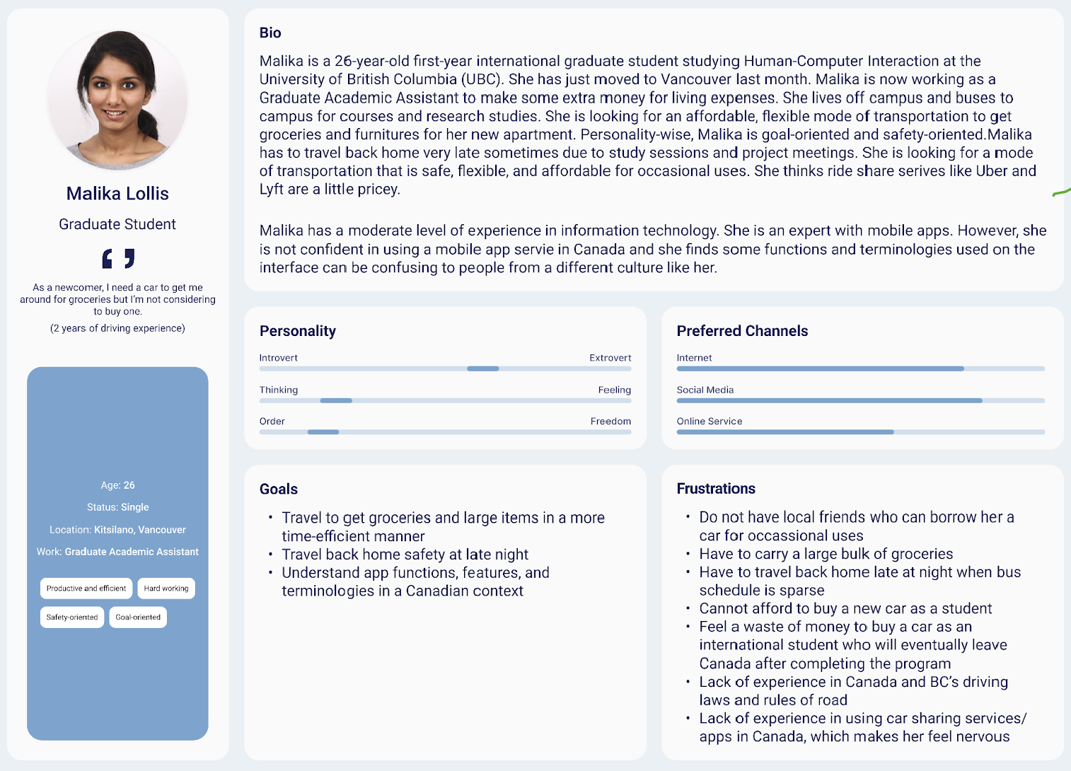
Persona3
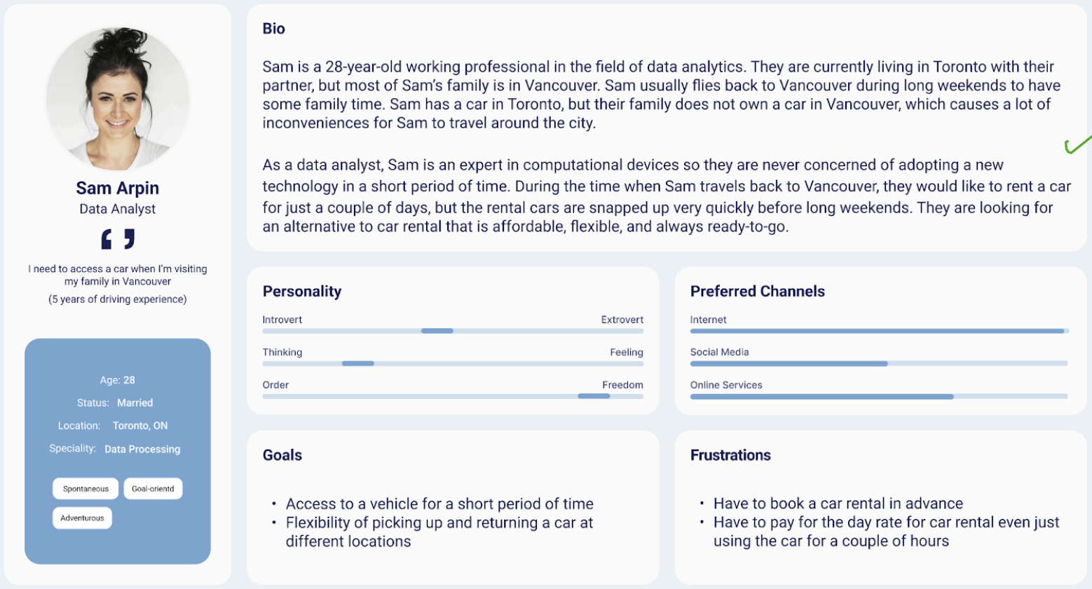
Persona4
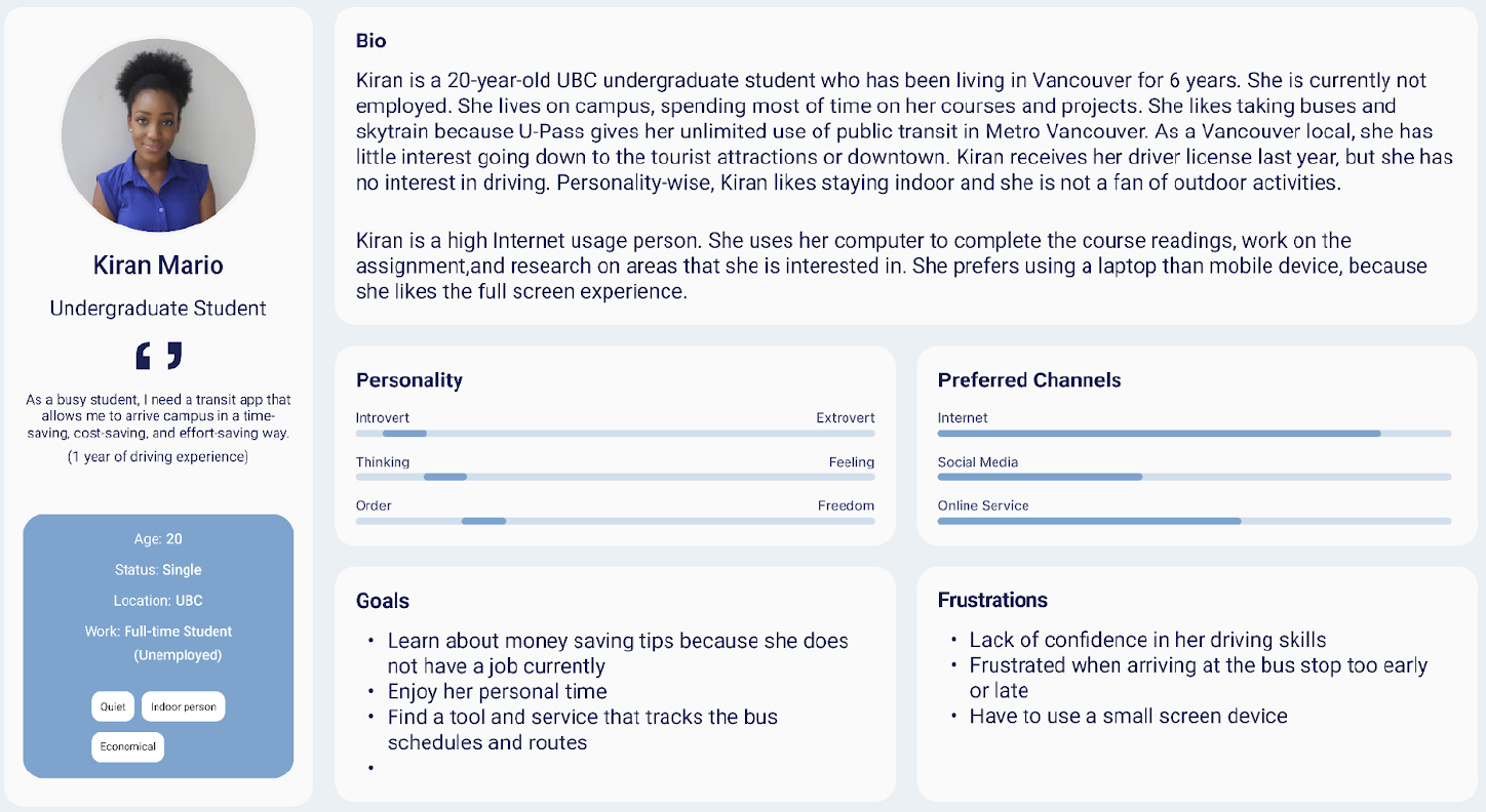
Persona5(anti-persona)
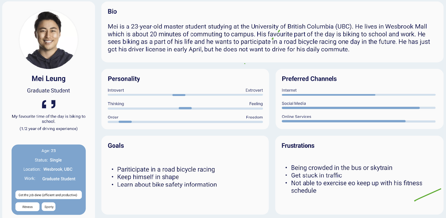
Persona6(anti-persona)
Content Inventory
The current content inventory of the Evo Car Share app is listed here (Click here to see the detail).
Information Architecture
Current Information Architecture
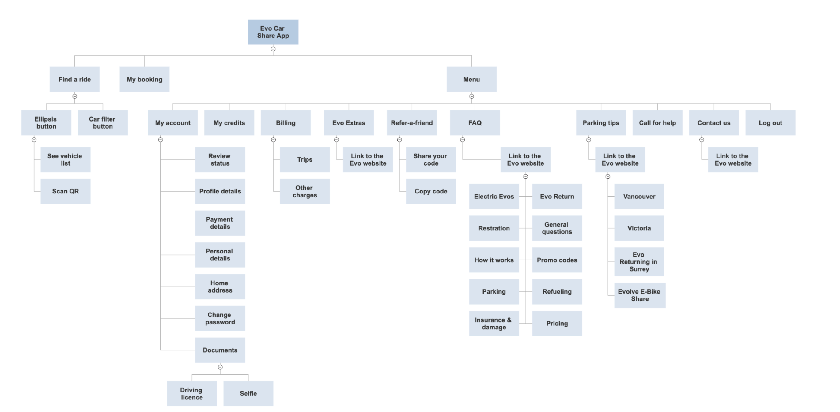
The current information architecture of the Evo Car Share app compromises 3 major sections, including “find a ride”, “my bookings”, and “menu”. The current information architecture is function-oriented and mutually exclusive in terms of the actions intended. We consider it an appropriate and effective way to categorize the tasks and help the users to find a particular action or service they would like to proceed with.
Card Sorting
Methods and Process
We conducted an open card sorting test with 10 participants to investigate the labeling and grouping issues with the current Evo interface and potential ways to redesign it. An online software called Optimal Sort was used to allow participants to sort cards independently on their own computers. Participants were asked to categorize cards into groups that make sense to them and label each group with an ideal group name. We decided to use an open card sorting method primarily because we were interested in 1) the degree to which different users would create similar groups of cards, and 2) how users might label these groups. We considered that these two questions would be critical to help us to redesign user-centered global and local navigation menu labels.
We created 24 cards, each representing an item of content on the menu page. These content items were identified by our content assessment of the current app, supplemented or adapted based on the findings of the competitor analysis and user research in part 1. The following lists out the cards.
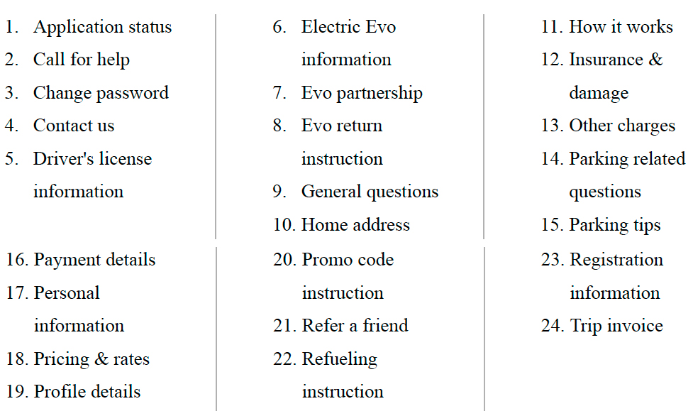
We recruited 10 participants to perform an open card sort of the 24 cards using the card sorting tool Optimal Sort. The card sorting exercise took the 10 participants a median time of 5 minutes and 8 seconds to complete the study. The longest time was 30 minutes and 13 seconds. The shortest time was 2 minutes and 7 seconds. And the 10 participants created a total of 48 categories, with a median of 5 categories each.
Analysis and Results
Once the card sorting was completed, we standardized the results as recommended by Optimal Workshop. This involved “merging”, for purposes of our analysis, categories generated by respondents that were conceptually similar, such as ”FAQ”, “Q &A”, “Questions & Instructions” and “General Question”. This standardization helps when exploring the degree to which different users would sort cards into conceptually-similar groups regardless of label names.
After the standardization process was complete, we reviewed the dendrograms (Best merge method) (Figure 1) and similarity matrix (Figure 2) visualizations provided by the Optimal Sort software, which illustrates the card sorting results and indicates that some labels should be grouped together based on wide consensus.
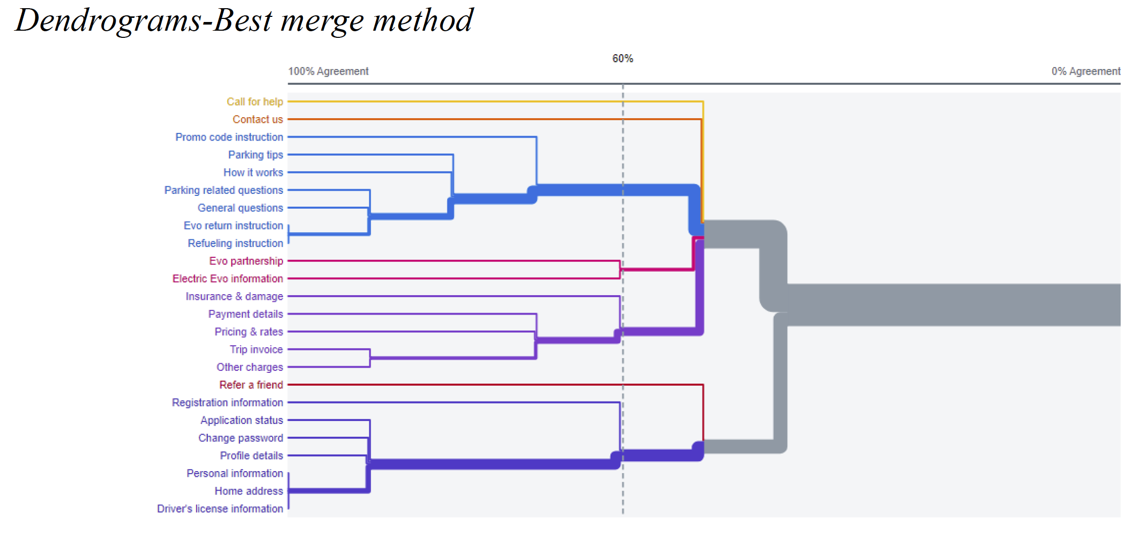
Figure 1
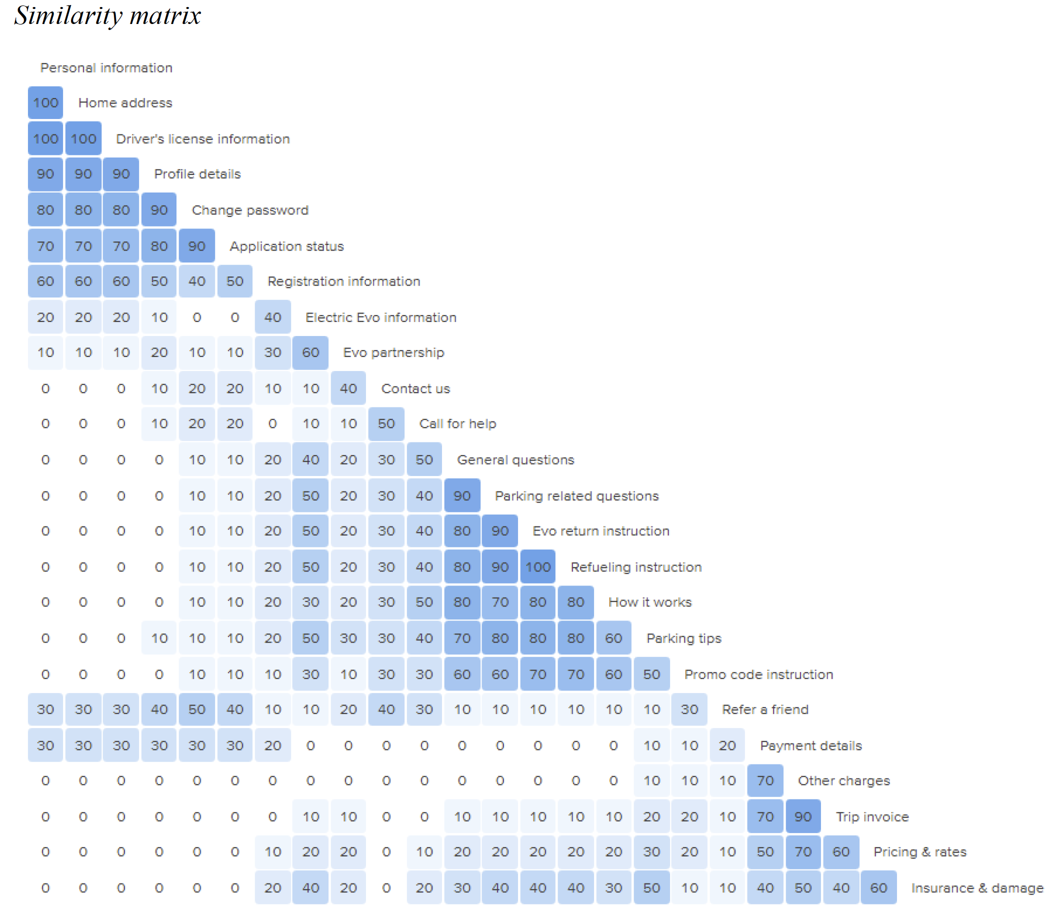
Figure 2
We decided on the “best merge method dendrogram” instead of the “actual agreement method dendrogram (skeptical dendrogram)”. The “best merge method” makes assumptions about larger clusters based on individual pair relationships, which often performs better than the actual agreement method when the study has fewer participants. Since we only had 10 participants, the best merge method dendrogram is more appropriate than the “actual agreement method dendrogram” which works best with 30 or more participants and depicts only absolutely factual relationships.
According to the results from the dendrograms (best merge method) and similarity matrix as well as the labeling and grouping of the redesigned information architecture of the menu page, we revised its original information architecture. After merging the cards “Parking related questions” and “Parking tips” as one card “Parking tips & questions”, the 30 labels (the 23 cards in 7 groups) are as follows:
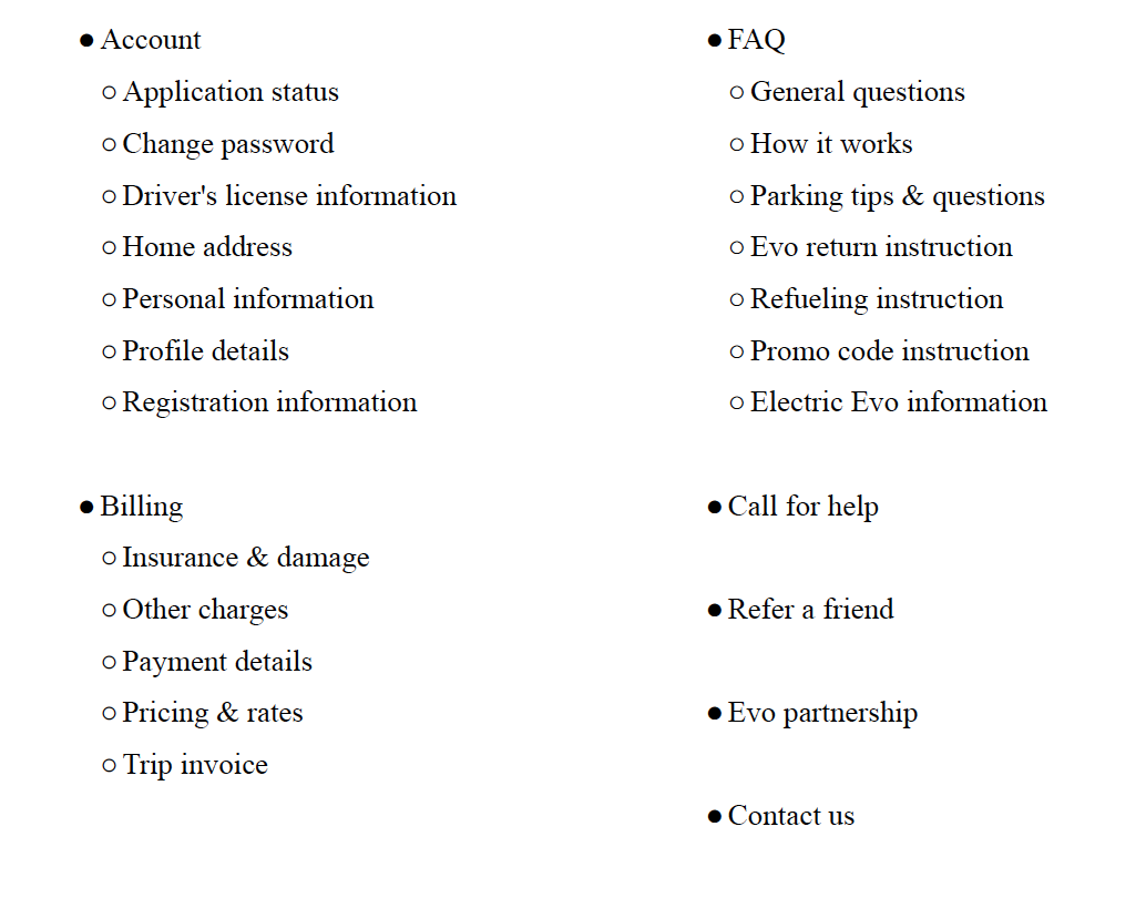
Redesigned Information Architecture
Based on the findings from card sorting, we have created the redesigned information architecture as follows
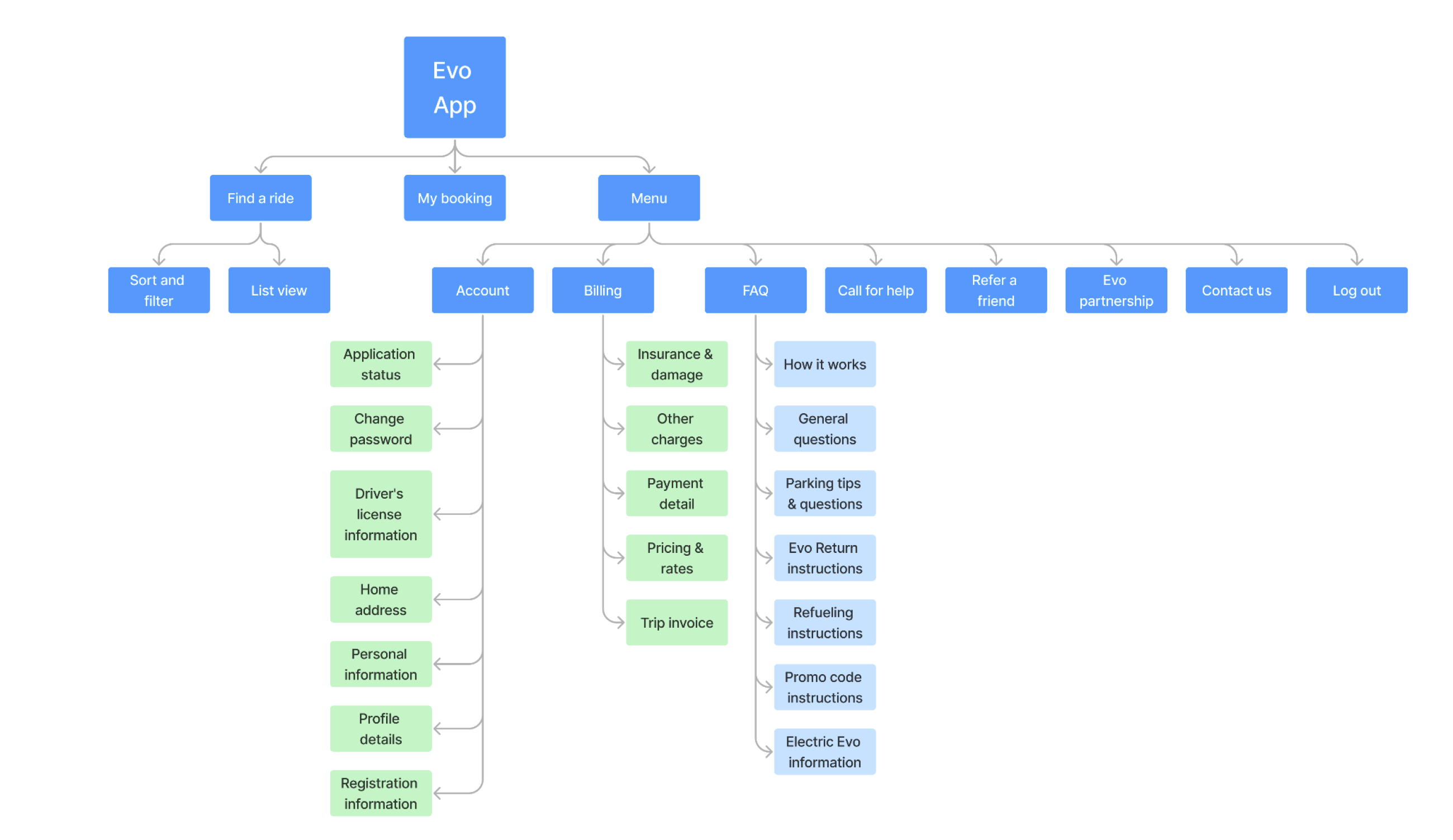
Global and Local Navigation
Global navigation on the Evo app is represented by the bottom navigation bar where users can tap to access the primary pages of the App, including "Find a ride", "My bookings", and "Menu". It shows users where they are, where they can go, and how they can get there. To navigate between sections within a page, local navigations, including filters and back buttons, are provided for users to select a piece of particular information and return to the previous stage.
Evo’s navigation meets the principle of consistency. The location of the bottom navigation bar does not change when users switch to other pages on the app. Additionally, there is interaction on each bottom navigation tab. For example, when the user taps on a navigation tab, the color of the tab will be highlighted to inform the change in the system status. As for local navigation, on the "Find a ride" page, there are two function buttons at the top right corner to help users sort and find the vehicle they are looking for. On the "Menu" page, the local navigation contains 9 pages to help users find the help and documentation information they need.
We decided to keep using the original typography and color palette for the redesign to ensure the consistency of Evo’s branding. We planned to redesign the local navigation on the home page 12 based on the usability testing feedback. Moreover, we planned to replace the "see vehicle list" icon button with a drag-down overlap above the map view for more smooth and intuitive interaction.
Labeling and Grouping
In the redesign stage, we would like to maintain the internal consistency of labeling with Evo’s branding while making a couple of adjustments to the grouping of information. The iconic labels used in the bottom navigation bar and menu items help to provide consistent and easily understandable content for inexperienced users and provide an aesthetically appealing visual experience. The icons used on Evo’s interface reflect their real-world counterparts and are fast to recognize at a glance. For example, the icon of a magnifying glass is to represent the “Find a ride” function and the icon of a calendar is to represent the “My bookings” function. For most other clickable labels on the app, we decided to use text-based navigation tabs and buttons to streamline users’ browsing experience and improve the readability of the content-heavy menu page.
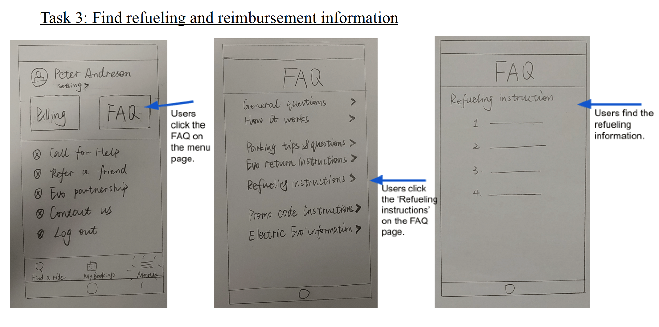
As informed by the card sorting findings, we updated the grouping of information categories on the “Menu” page to match the system’s conceptual model with the users’ mental model. We believed the level of agreement within the participants’ grouping indicates an optimal way to categorize different sections within pages and determine the information hierarchy. For example, the number of text buttons on the “Menu” screen has now converged from 9 to 7 categories. And some of the information like “parking tips” are placed in a lower hierarchy under the “FAQ” category to reflect the hierarchical relationship from a broad group of information to a specific topic of information. The order of the categories has altered as well. Inspired by the app interface of Uber, we planned to increase the button size of "FAQ" and "Billing" and have them placed in the first row of the menu. This is because we would like to ensure users are able to locate the most important information in the first place when they open up the menu page for help and assistance. Another design consideration we decided to make is moving the “call for help” button away from “contact us”, because usability testing has informed us that participants get confused about which button to click on when they need roadside assistance.
Pencil and Paper Prototype Drawings
Processes
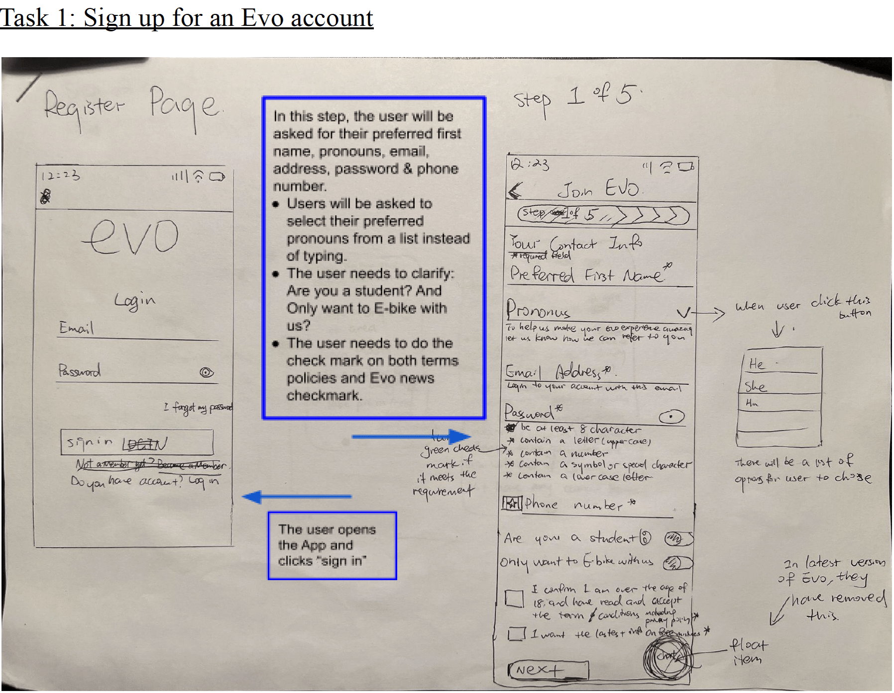
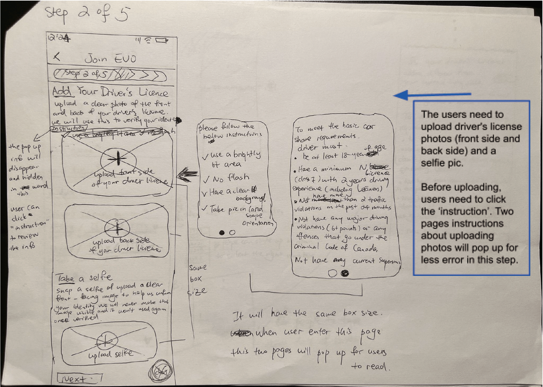
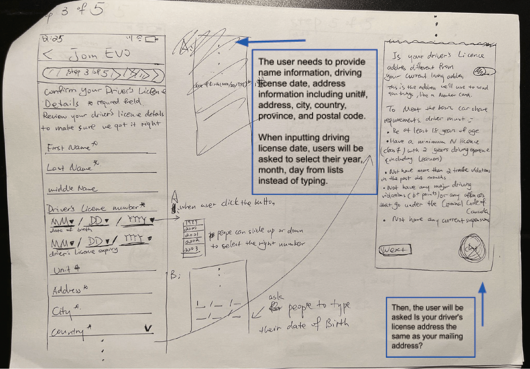
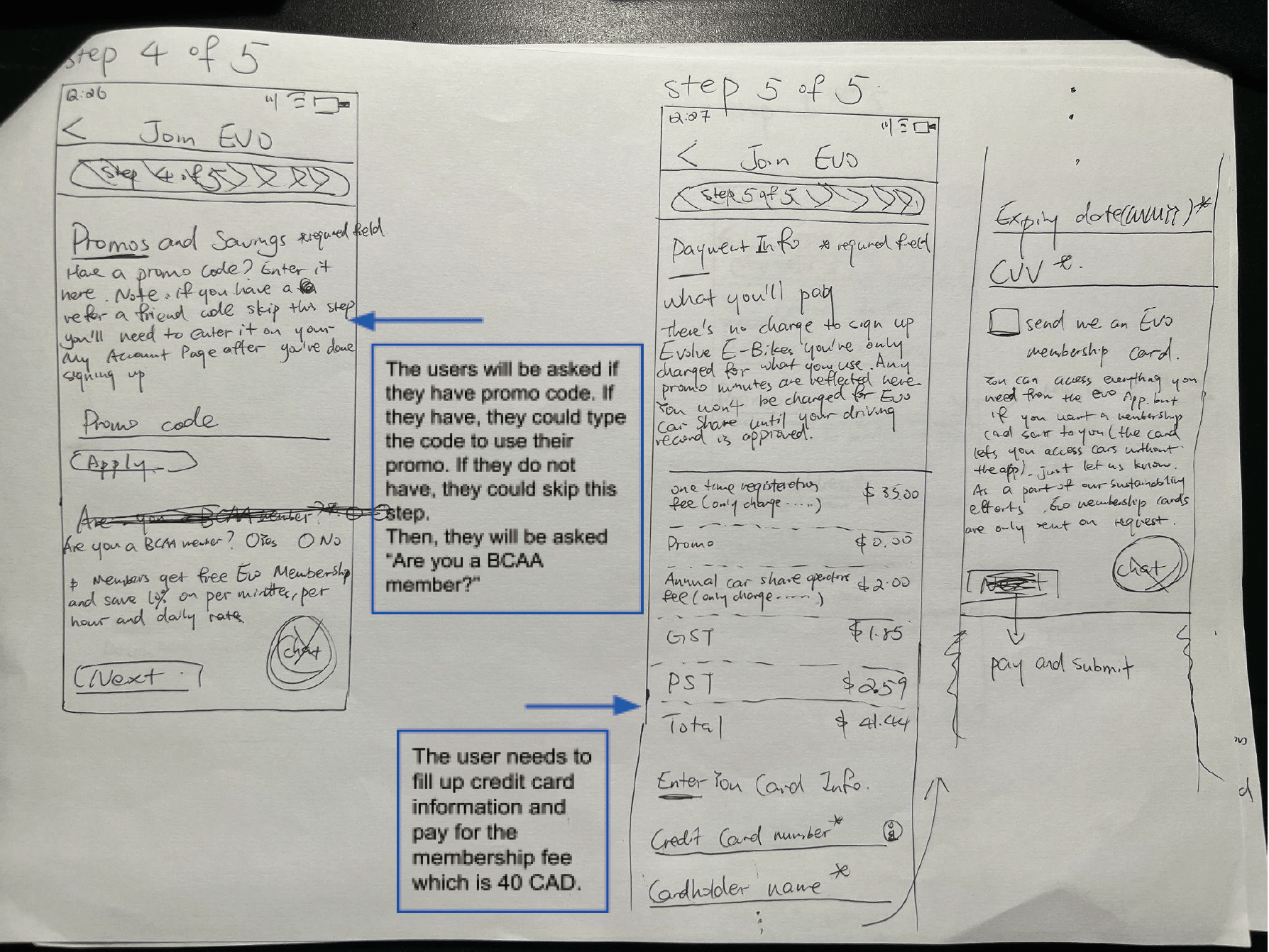
Since high-fidelity prototypes have many disadvantages (i.e. time-consuming, designers resisting changes), we decided to sketch the low-fidelity prototype using paper and pencil as our first prototype in the iterative design process. Low-fidelity prototyping like paper and pencil prototyping enabled the design team to focus on the structure, functions, and features of the app. It is also time and cost-saving, fast to implement, and easier to change and recreate regarding some specific features or the whole prototypes, which has more potential to increase the number of possible iterations than high-fidelity prototypes.
Taking into consideration the useful information gathered in the previous research that informs the redesigned information organization, we created and annotated our pencil and paper prototypes by walking through the steps needed to complete the 6 user task scenarios designed in part 1. When considering these paper prototypes for 6 user task scenarios together, they are broad enough to cover most of the features and functions of the app. When presented separately, they are also complete and in-depth enough to evaluate the selected features and functions in each task scenario, which balanced the advantages of vertical and horizontal prototyping.
Pencil and Paper Prototype
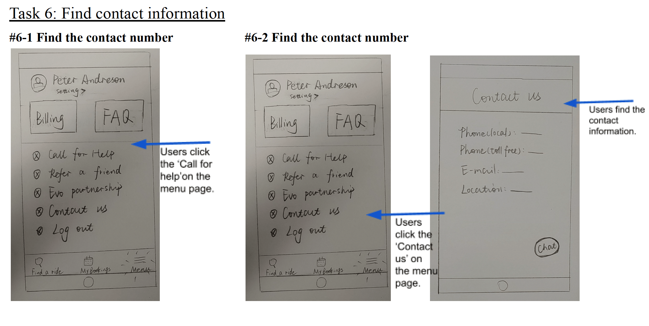
Working Prototype
Prototype link
Click here to try the prototype
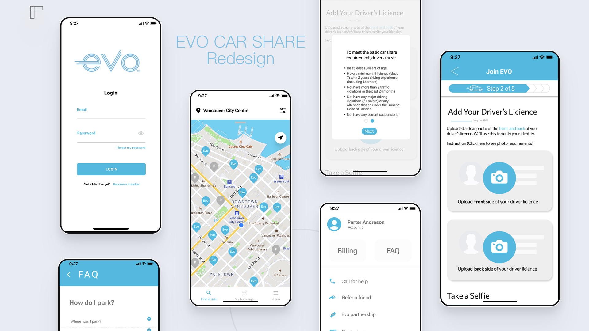
After completing the paper prototype, our team decided to use Figma to collaboratively complete our mid-fidelity prototype. In order to ensure the consistency of the design and the similarity to the original App, we unified the color code of the App, which are blue (#54B9DE), gray (#BCC1C2), and black (#000000). We also applied a font similar to the App: Robot Flex for the title and Commissioner for the body. In addition, we also collected the logo of the Evo car share through Photoshop's matting function and then placed the logo at the top of the registration screen. We also searched free licensed SVG files for each icon using Google. After setting up everything, it took us about 5 days to finish the prototype.
In order to provide a better testing experience for usability participants, we connected all pages to ensure that the prototype was usable. Then, we invited two of our friends who are UI designers to test the prototype and made some changes based on their feedback.
The mid-fidelity prototype is presented as follows:
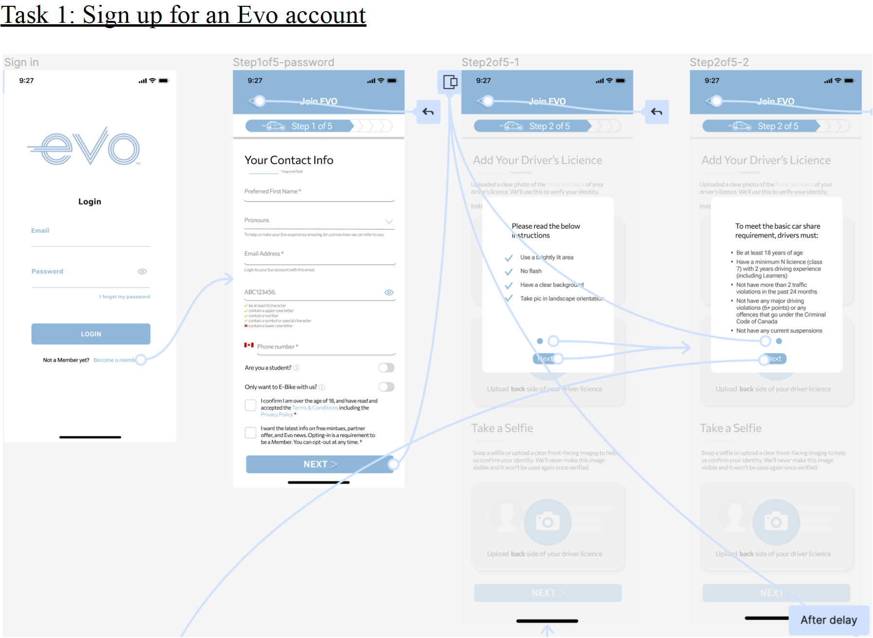
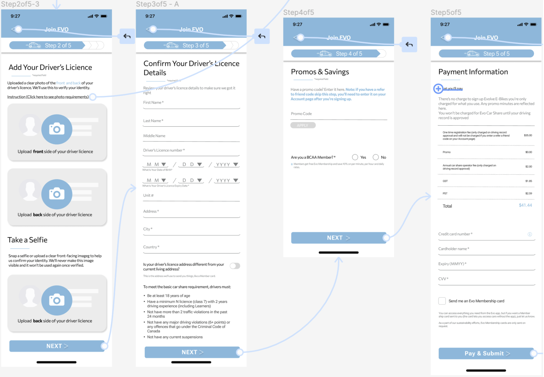
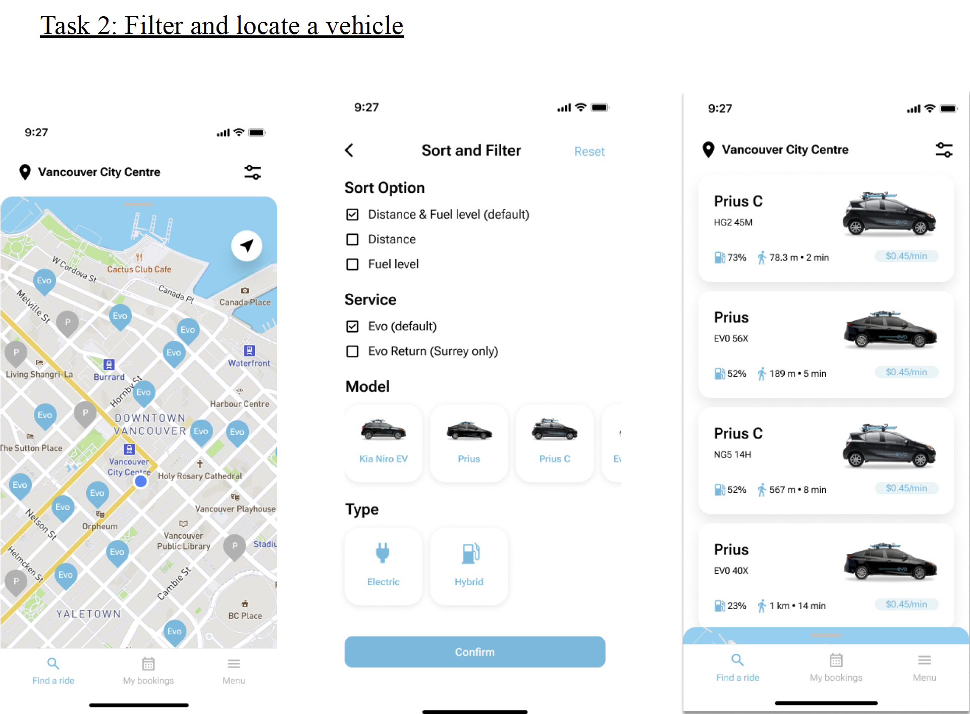
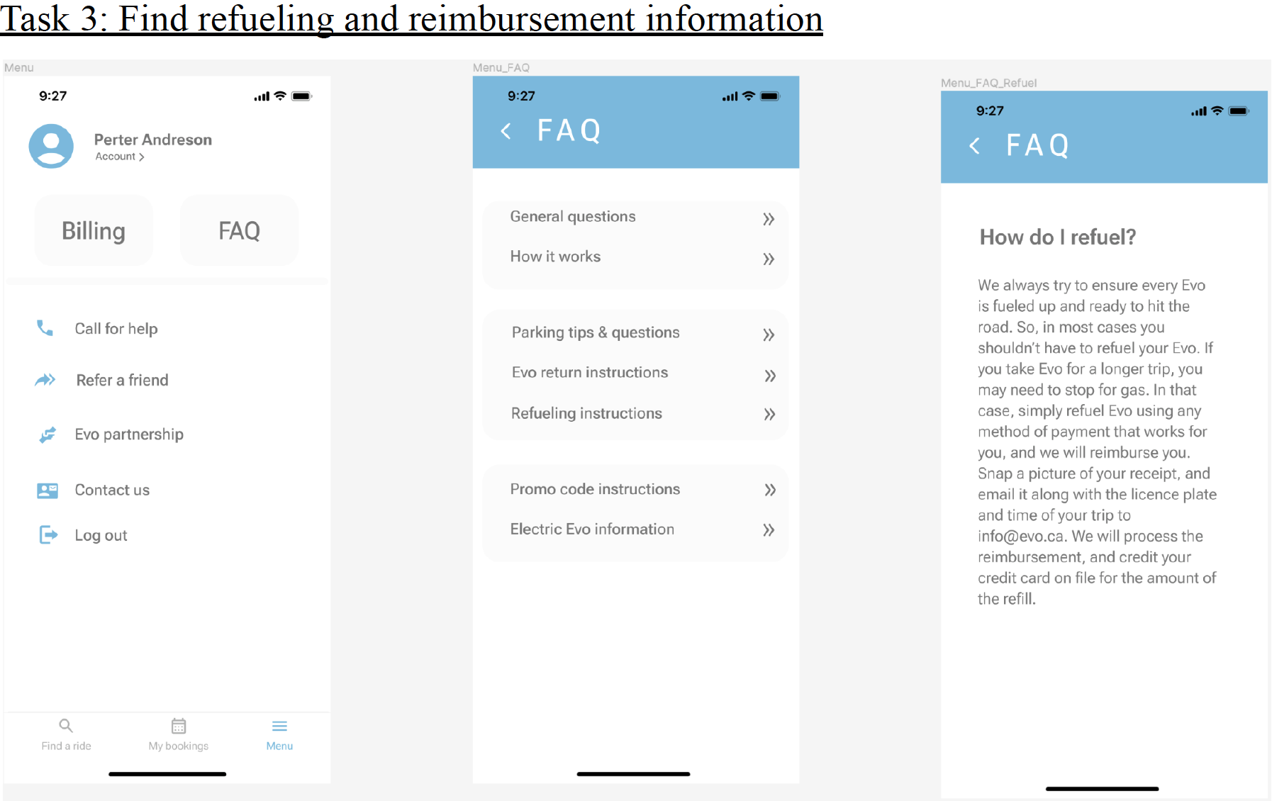
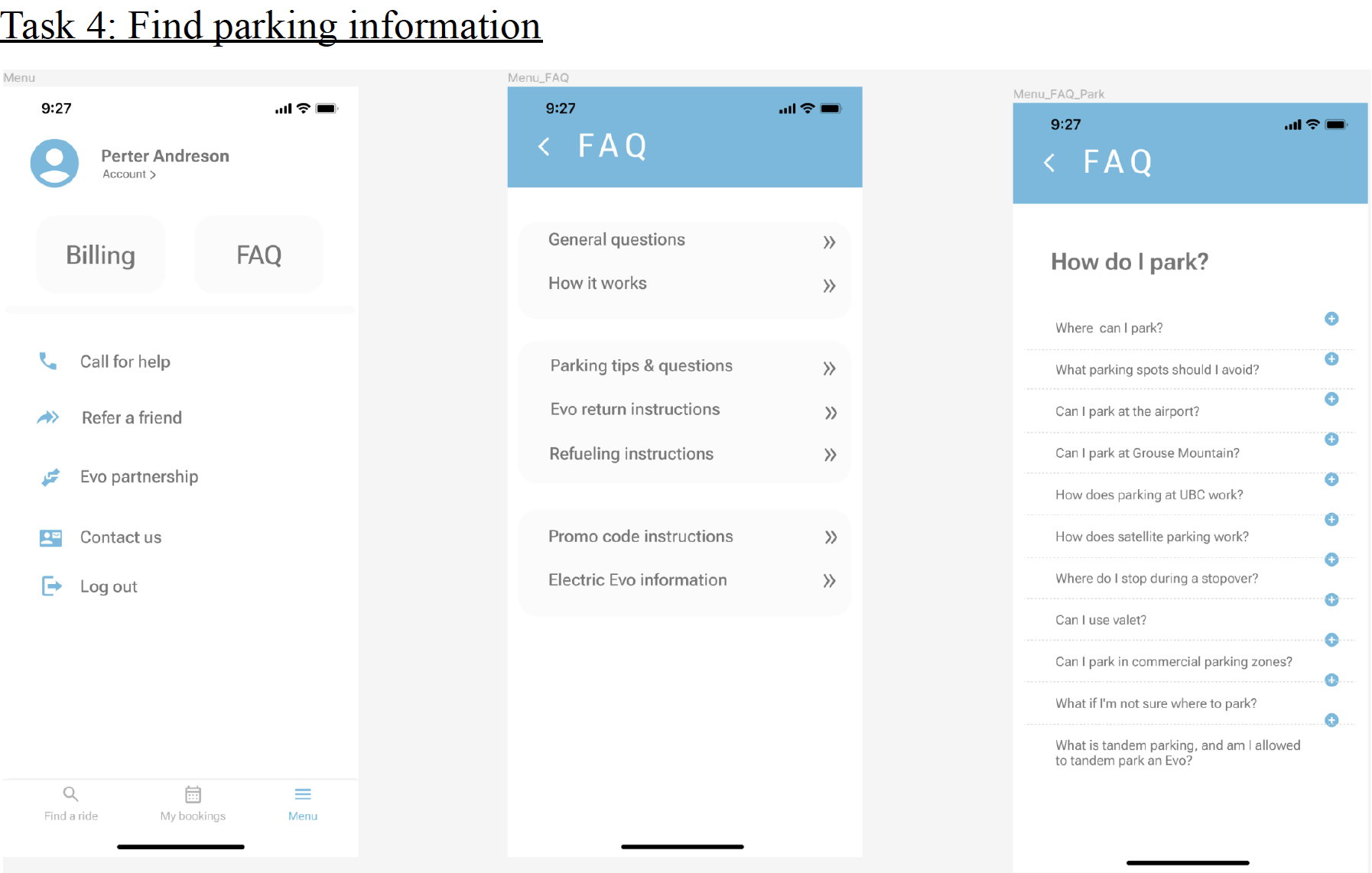
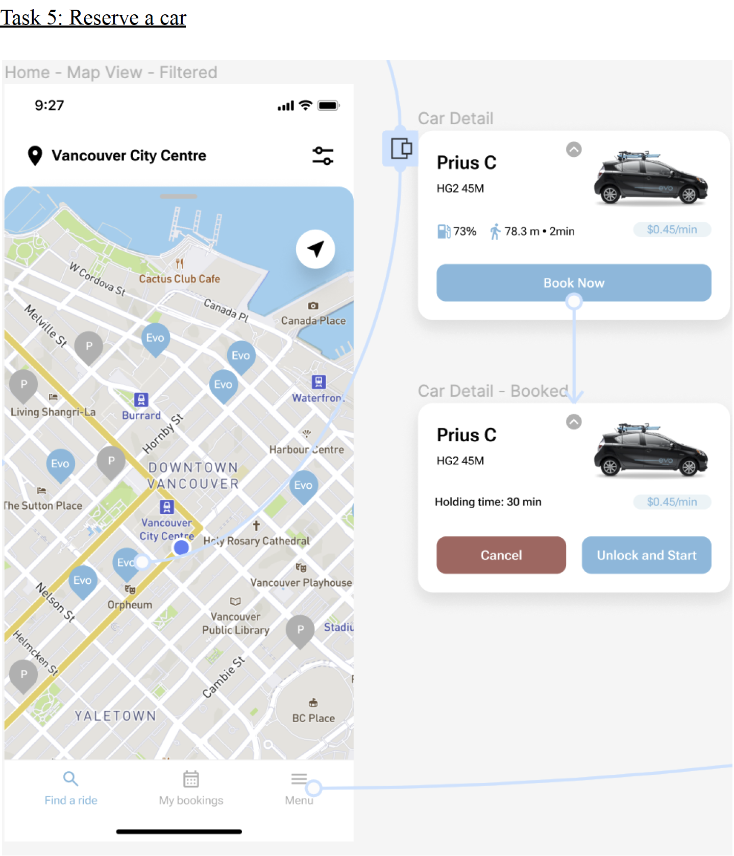
User Testing
Methods and Processes
We conducted a usability study on 5 people who had been conveniently sampled to do the usability test in part 1. The usability study aimed to investigate the ease of access and use of the Evo Car Share redesign of the mobile application. We developed a user testing protocol to ensure that we can get the best information from the study. The user testing consisted of a user test and a short semi-structured interview. The process is similar to the previous one in Part 1. The only difference is that we did not book the study room for the tester this time. Instead, we asked our participants to do the test through Zoom, and they were given a prototype link to do the test on their computers. In order to see the difference in user behavior between using the redesigned app and the original app, the tasks given to participants are the same as the ones created in part 1. Meantime, we recorded the testing process and their behavior on the app for future analysis.
Note-taking Summary
Conclusion
Compared with the Part 1 Usability test, we found that the user spent much less time on each page when completing each task than in the first test. Plus, everyone made fewer mistakes and asked fewer questions during the test than before. Regarding the “find a ride” page, we realize that instruction is needed when introducing a new or updated function to the user. It is also significant to provide feedback when users complete the vehicle rental. In this case, we accepted our participant’s advice, creating a notification window when the vehicle is reserved. As for the “Menu” page, we decided to keep the redesigned layout since 80% of participants are used to this pattern. In general, all participants said that they preferred the redesigned user interface because it tremendously improved the user experience of this App. Moreover, most people thought the “Menu” page was more straightforward and intuitive than the original one.
Limitation
Since we asked only 5 participants to do the test, there are some issues that we are not sure if it's subjective or objective. For example, we cannot provide a better solution to differentiate the “contact us” and “call for help” pages because we think these two pages play different roles. Although 3 out of 5 participants believe it is acceptable, 2 participants still think it is unclear. If thousands of participants are tested on this function, the result will be more convincing and help us make proper decisions. Additionally, 5 participants had done the task before and become familiar with the App already. In this case, we do not know if new users will get confused with the information architecture and user interface. Lastly, since the layout of the registration process and the “find a ride” page were redesigned significantly, we do not know if backend developers can achieve it.
Conclusion
The major challenge encountered when it comes to redesigning the existing Evo mobile interface is not reinventing the wheel while maintaining internal consistency with Evo’s branding. We 29 took into consideration the typography, color palette, and other design patterns used on the current interface to make sure the consistency of the visual experience throughout the redesigned version. We also studied design guidelines like the iOS’ Human Interface Guidelines and Web Content Accessibility Guidelines (WCAG) to create a compelling design with the support of intuitiveness, usefulness, accessibility, and consistency. Another problem we countered is the constraint of time, which limited the sample size of our research participants. We admitted that the lack of diverse samples may bias the research results and impact the design outcome. The convenience sampling strategy we used to source participants for the usability study and user testing cannot fully represent the entire population of Evo users. The conclusion of the research results thus lacks clear generability.
The perceived success for our team is the deliverable of a mid-fidelity prototype. While it’s not highly functional like a high-fidelity prototype or a coded product, it meets the need for user testing and has helped us to collect valuable input for future iterations. The design also succeeds in providing a simple and navigable account registration process with a progress bar and clear instructions on the steps. The redesign of the menu screen better supports novice and infrequent users to locate the help information from a cluster of buttons. While the swiping overlap to switch between the map view and list view is successful, a shortcoming we noticed from the user testing is that this function may not be noticeable to inexperienced users. Although we had an iOS default overlay grabber on the top of the overlap to indicate potential interactions, users who have less experience with digital technology and iOS interfaces may have a hard time understanding the meaning. Therefore, we later decided to add a coach mark for first-time users to aid them in learning how to swipe between the map view and the list view. Based on other feedback we got, we would also like to provide a clearer indication of the difference between “call for help” and “contact us” to reduce user friction while looking for the help information. A potential way to reword “contact us” to “about us”.
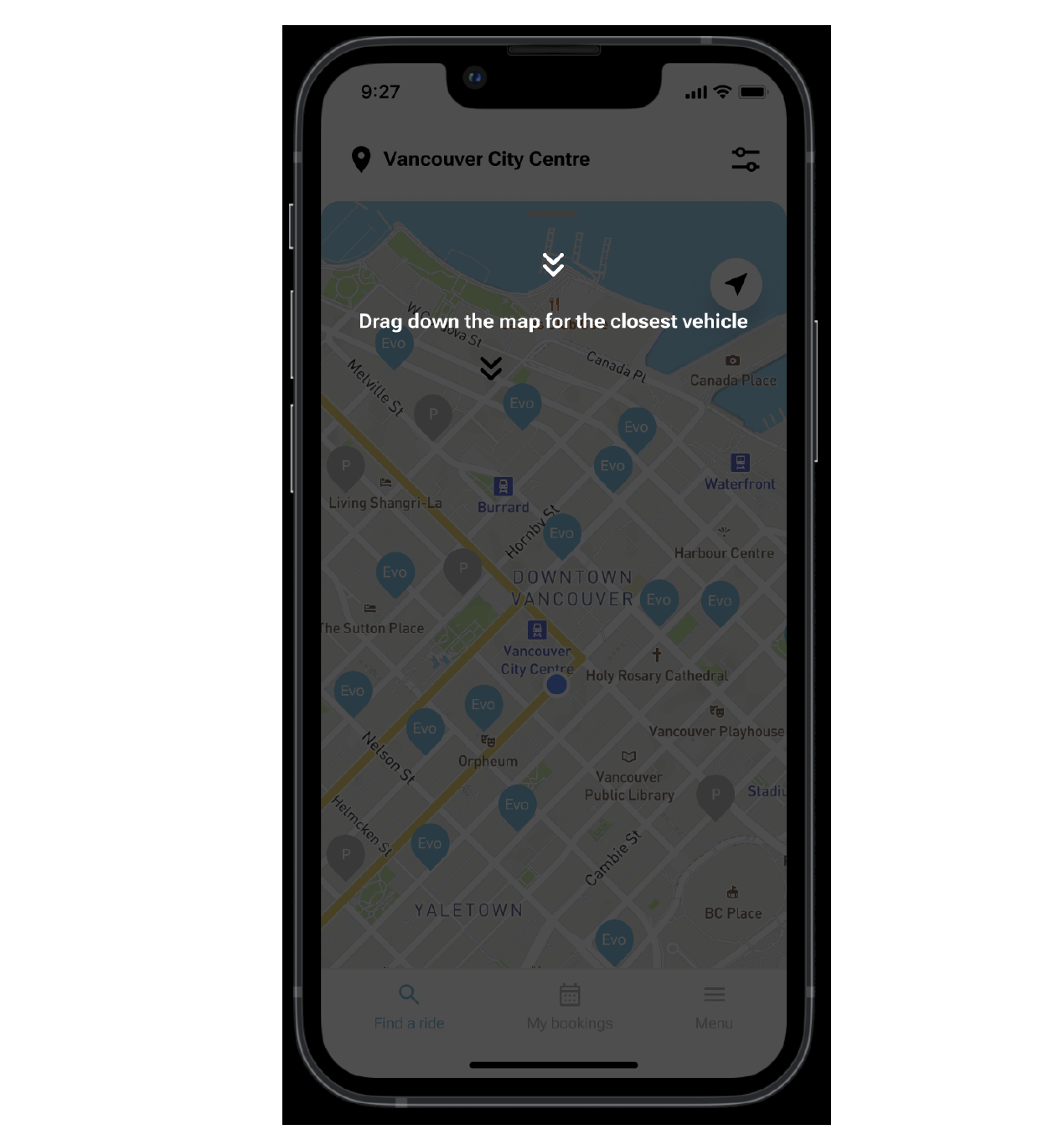
Coach Mark
If we had more time, we would like to go more vertical in the prototype design to create a full product experience for user testing. This could require more tasks to design. For instance, possible sections and tasks to add include the sign-in process for registered users, trip canceling, safety check-in, and stopover process. Although some of the tasks are not addressed by our 30 primary personas, those are still critical for Evo users to complete their trips. We also learned through user testing that push notification is an important interaction to alert users of system status and possible actions to take. If we had more time for this project, we could possibly create a push notification design to inform users that the vehicle booking is successful after hitting the confirm button.
The most problematic stage of the design lifecycle is the transition between each design phase, which is about defining the appropriate scope for the next steps. For example, we struggled with a large number of qualitative data sets during user research to determine what user needs should be prioritized considering the time and resources constraint of this project. It took us a lot of time to scope down the user personas and task scenarios due to the number of data points. If time permits, we would like to fully utilize design thinking and double diamond models to explore issues more widely and narrow down the actions quickly. Another stage we felt was problematic is the ideate phase which requires a lot of brainpower and design experience to produce potential design elements. We enjoyed the creative process of transforming the written design requirement into a paper and pencil prototype towards the end of this project.
The most important lesson learned through this project is being agile. We were used to waterfall-like projects where milestones and deliverables were set in stone at the beginning of the project. However, our team went through numerous rounds of iterations to refine the scope, better understand the user needs, and make the design polished. For future projects, more time could be spent continuously testing out the concept and making adjustments to the design. We believe that the iterative design approach could help to provide robust user feedback, build rapid evolution of design, and experiment with a large variety of ideas.
